The two Axes of Flexbox
 Natan Ferreira
- 0
- 84
Flexbox is widely used nowadays, as it is possible to create complex and flexible layouts in a simple way. Before Flexbox existed, it was more complex to create layouts.
Introduction
We have two directions: row and column. We can specify the direction using the flex-direction property. There are two axes: the main axis and the cross axis. I’ll illustrate this with an example to make it easier to understand.

For example if I set flex-direction: row, the main axis will be the row.

Therefore the cross axis will be column.

Let’s do some examples.
Practice
I created a container with 3 boxes inside it.
<!DOCTYPE html>
<html lang="en">
<head>
    <meta charset="UTF-8">
    <meta name="viewport" content="width=device-width, initial-scale=1.0">
    <title>Flex</title>
    <link rel="stylesheet" href="styles/style.css">
</head>
<body>
    <main>
        <div class="container">
            <div class="box">Box 1</div>
            <div class="box">Box 2</div>
            <div class="box">Box 3</div>
        </div>
    </main>
</body>
</html>
This html references a css file with the styles.
.container {
    display: flex;
    flex-direction: row;
    width: 600px;
    height: 400px;
    background-color: 	#4682B4;
    border: 2px solid black;
}

.box {
    width: 150px;
    height: 150px;
    background-color: #4169E1;
    border: 1px solid black;
    color: white;
}
This is the result:
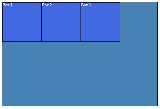
The boxes are too close together, and I’d like to add space between them and the edges. How can I achieve this?

Now, I’ll apply the following code to the container: justify-content: space-evenly;.
.container {
    display: flex;
    flex-direction: row;
    width: 600px;
    height: 400px;
    background-color: 	#4682B4;
    border: 2px solid black;
    justify-content: space-evenly;
}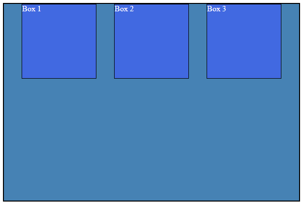
The justify-content property affects changes along the main axis, which, in this case, is the row.
With space-evenly, items are distributed evenly, with equal gaps at the start, in-between, and end.
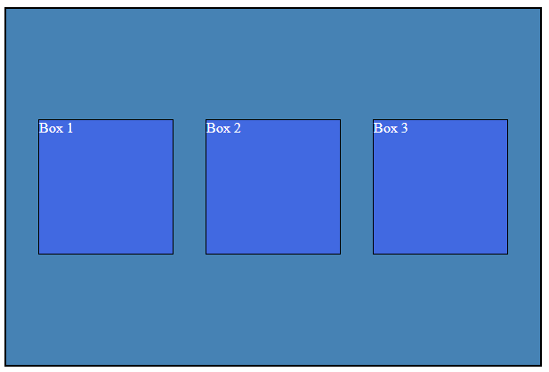
However, this doesn’t provide the desired result. I want to center the items. To achieve this, we need to apply changes vertically, using the align-items property. This property is responsible for making adjustments along the cross-axis.
.container {
    display: flex;
    flex-direction: row;
    width: 600px;
    height: 400px;
    background-color: 	#4682B4;
    border: 2px solid black;
    justify-content: space-evenly;
    align-items: center;
}
Conclusion
Understanding the axes in flexbox is crucial—a fundamental and essential concept. There are numerous properties available for use with flexbox.
You can find more here: https://developer.mozilla.org/enUS/docs/Learn/CSS/CSS_layout/Flexbox
Author
-

I am a seasoned Full Stack Software Developer with 8+ years of experience, including 6+ years specializing in Java with Spring and Quarkus. My core expertise lies in developing robust RESTful APIs integrated with Cosmos Db, MySQL, and cloud platforms like Azure and AWS. I have extensive experience designing and implementing microservices architectures, ensuring performance and reliability for high-traffic systems. In addition to backend development, I have experience with Angular to build user-friendly interfaces, leveraging my postgraduate degree in frontend web development to deliver seamless and responsive user experiences. My dedication to clean and secure code led me to present best practices to my company and clients, using tools like Sonar to ensure code quality and security. I am a critical thinker, problem solver, and team player, thriving in collaborative environments while tackling complex challenges. Beyond development, I share knowledge through my blog, NatanCode, where I write about Java, Spring, Quarkus, databases, and frontend development. My passion for learning and delivering innovative solutions drives me to excel in every project I undertake.
